A powerhouse practice, AJC has been thinking about and shaping modern Sydney in both subtle and profound ways for seven decades.

Branding & Strategy
Website
Collateral
Social

humble beginnings to powerhouse

Originally founded in 1956 by friends John Allen and Russell Jack, the firm welcomed Keith Cottier in 1965, forming the dynamic Sydney studio of Allen Jack + Cottier. It became synonymous with creative, spatially inspiring spaces and places. Known for architecture that inspires and endures, the practice now celebrates 70 years with a refreshed brand identity that reflects both its history and evolving vision.

Wordmark

At the core of the rebrand is a geometric wordmark—a modern interpretation of the initials of founders Allen, Jack, and Cottier. Set in black or white and paired with a new typeface, the mark signals a confident new era for the practice. Its design draws from the studio’s earliest logo and the fundamental forms of architecture itself: circle, square, and triangle—the primary shapes from which all structures are born.

Integrated system

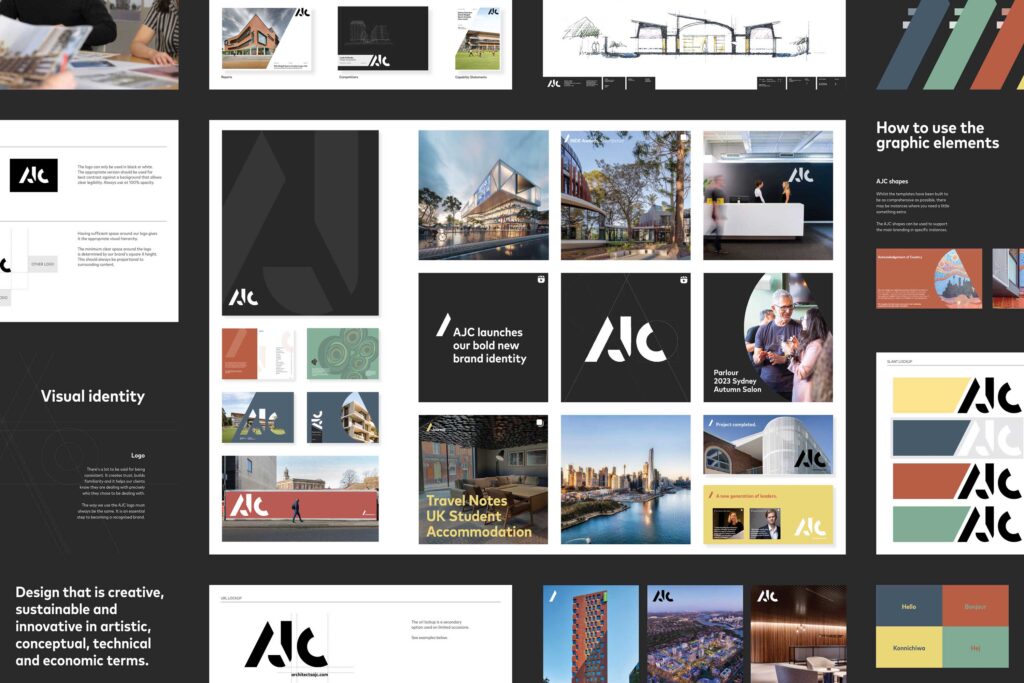
The new identity was designed as a fully integrated system, ensuring consistency across every expression of the AJC brand. From print collateral to digital platforms, the visual language extends seamlessly, balancing geometry with typography. A key part of the rebrand was modernising the practice’s internal tools and communications. Templates, title blocks, project sheets, competition documents, and capability statements—largely unchanged since the founding days—were rethought and redesigned. This not only refreshed AJC’s outward presence but also streamlined day-to-day operations, giving the team a more cohesive and professional foundation to build from.